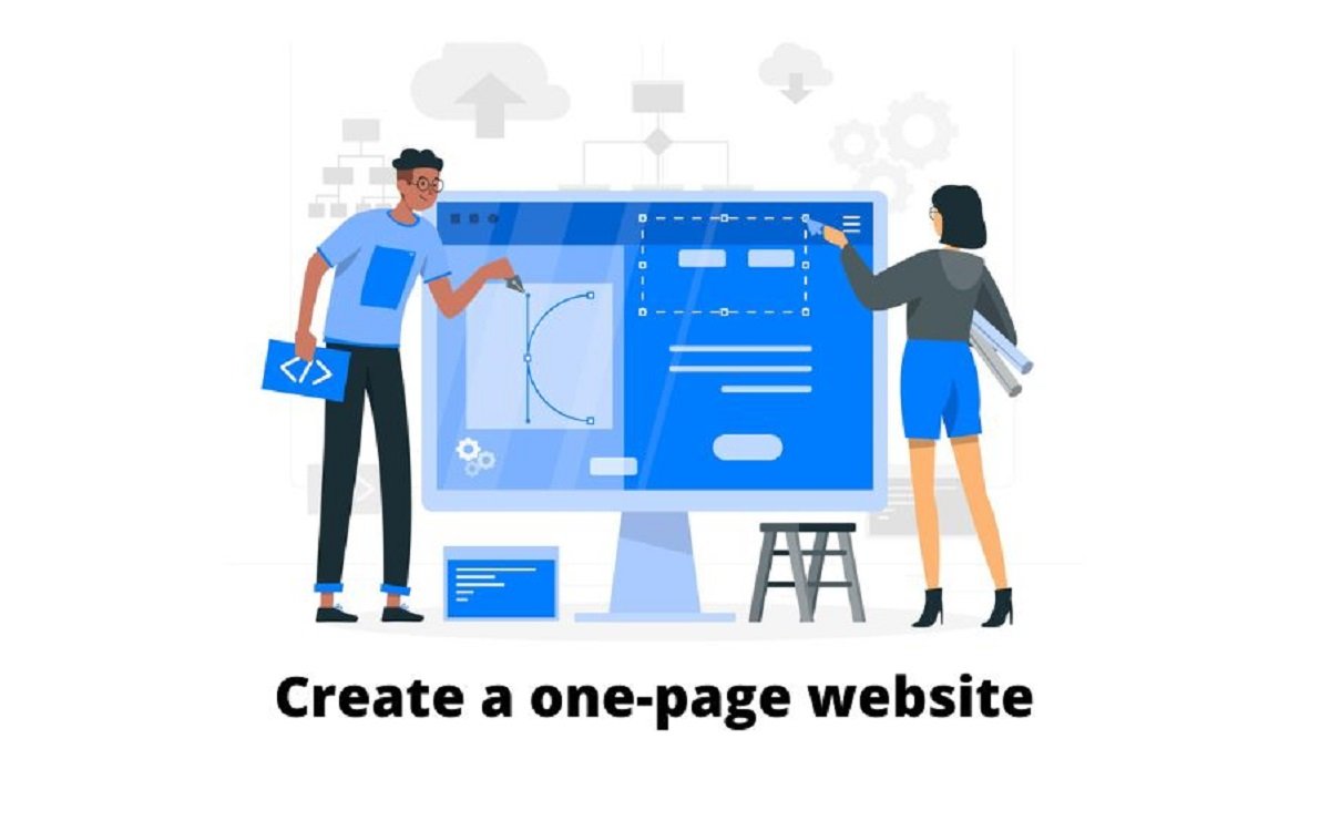
These days, one-page websites are very common. It is undoubtedly the simplest substitute for a typical multi-page website. If you're going to create a website for the first time, you could find the process a little intimidating but exhilarating at the same time. You may easily develop a professional one-page website thanks to the market's abundance of one-page website builders. It might, however, make it more difficult for you to choose the ideal alternative for your website.
Website builders may be incredibly helpful when building both a one-page website and a traditional multi-page website. However, there are both comparable and distinct steps throughout the entire website-building process. And you may have your website ready with only a few clicks. When building a one-page website that will assist you in establishing your own online presence, there are various considerations that you should keep in mind. Make sure your website is simple to use & does not contain unnecessary content.
The advantages of having a one-page website can occasionally change depending on your company's needs. Companies usually build one-page website with the aim of selling a single product. And reading this article can be a huge assistance for you if you are one of them and are looking for a way to make a one-page website. So let's begin!
Table of Contents
1. What Is A One-Page Website & Why Should You Create One?
2. How to Create a Professional One-page Website?
3. Avoid Complexities & Make it Simple
5. Add Media To Make Your Website Look Appealing
6. Keep Your Navigation User-Friendly
7. Create Strong Calls To Action (CTAs)
What Is A One-Page Website & Why Should You Create One?
A single-page website is another name for a one-page website. A one-page website template is different from a normal web page template. The content & info on your one-page website template will only be displayed on a single page, regardless of whether you refer to it as a one-page website or a single-page website. However, as the name implies, the entire website will just have one page. Yes! The entirety of the website will be shown on just one page. There aren't any further pages, such as those for contact information or an about us section.
One page will contain all the information about your product & services, your contact information, and whatever else you wish to present on your website. Users can easily scroll down to see the information you are giving them by doing so. You can display the facts more simply if you build one-page website.
In general, multi-page websites are commonplace. Additionally, one-page websites continue to be less common than multi-page websites. Nevertheless, there are a number of factors that may persuade you to build a landing page website. The difference between a one-page website and a multi-page website must be understood, though. Sometimes a single-page website can easily enlighten your users. Therefore, there is no need for a large, multi-page website. Therefore, let's quickly go over the justifications for having a professional one-page website. Here are some of the possible reasons you should read before you start learning how to create a professional one-page website.
Reasons
-
Simple device compatibility (smartphones, laptops, desktops, tablets, etc) across a broad range. Simple responsive web design gives you the freedom to run your website on any device that your users may be utilizing.
-
One-page websites can be quickly built with minimal resources.
-
One single page will result in a slower loading time. There won't be any problems either, like page refreshment. However, where necessary, dynamic data fetching is also used.
-
One linear page can include all of your relevant stuff. The visitor's attention is fixed on just one page.
-
A one-page business website is a fantastic choice for any company or business, no matter how big or little.
-
The single-page website's navigation is as simple as scrolling.
-
Since there are only one or two pages. Thus, the only available navigational method is scrolling.
-
Your users won't need to visit another page to get more details. They may conveniently retrieve the complete database on a single page.
-
Websites with just one page are more time and money efficient.
If you are unsure, create a multi-page traditional website first before creating a one-page website. Then you can pursue that as well. However, under the specific circumstances mentioned above, a one-page website can be a fantastic option. If you do not have any knowledge of coding, create your website on JoonWeb, which is a one-page website Builder where you can create a one-page website without any knowledge of coding.
Ultranative is one of the best one-page website examples
How to Create a Professional One-page Website?
Here are some suggestions for those who are creating a one-page website for the very first time.
Avoid Complexities & Make it Simple
One-page websites that are successful must have a strong presence. The most crucial principle to keep in mind is that less is more. Consider your primary message before building your website. Then, make sure your content is brief and to the point and that your wording is easy to read. Here you can also learn about an effective content strategy to keep your visitors engaged for a longer period of time.
When users come to your website, they want to immediately discover the information they need. Visitors shouldn't waste time looking for your contact details or an overview of your company's history. Set priorities and get rid of any unnecessary information to do this. Thinking about how your audience reads and interprets information is a simple method to accomplish this. What crucial details will they be seeking?
Set Up a Meaningful Layout
Ours is an instantaneous society. Plan and visualize how you want to structure your information to provide a simple reading experience. Divide your content into logical sections to help users quickly locate the information they're looking for, making each piece of the content count. If you are creating a website at JoonWeb you can easily add multiple sections on a single page to make it easier for your visitors to access the information they are looking for.
Utilizing the core principle is one method to build your website in a professional manner. The most important information, such as the purpose of your website, should be located at the top of the page. Drill down gradually to the more detailed supporting information after that. For instance, say you're building a website for an event. The most crucial details—what kind of event it is, when, and where it's happening—should be listed at the top of your website. The less crucial details, such as the parking lot, etc., ought to be near the bottom of the page.
Add Media To Make Your Website Look Appealing
Did you know that roughly 70% of people learn best visually? Because we are visual beings, visual content is one of the best methods to tell a narrative. No matter how well-written your text is, readers will rapidly lose interest if you don't break it up with multimedia. To attract and instruct your readers, add images, videos, and slideshows to your content. Make sure you add:
-
Videos: Videos on websites increase viewer engagement by 100%, and they are a great way to spice up your website content.
-
Images: To create a stunning one-page website, beautiful images are a necessity. You'll be sure to leave the best possible first impression on readers if you invest in some captivating, high-quality photographs. Images on a one-page business website that are striking create an atmosphere, represent your business and encourage users to stay on your website.
Keep Your Navigation User-Friendly
Even though visitors can browse your website by just scrolling, you still need to have navigation to maintain it user-friendly. People are guided via the navigation to the right place to learn more about your product or service. Make sure to maintain all the relevant information on a single page and organize it according to priority rather than sending people to different pages of your website. as stated in the first step.
Avoid using your navigation to send visitors to other websites. They might think it's a broken link since it's too unclear. Use icons to let users know where they're being redirected to if you do need to send them to external websites.
Create Strong Calls To Action (CTAs)
In order to ensure that your visitors know exactly where to go next, we frequently discuss how crucial it is to build your homepage with powerful call-to-actions. Websites with just one page are also common.
Consider all the occasions when you have registered online. Have you subscribed to a newsletter before? Dropbox or Wynk music downloaded? The website's compelling call to action resulted in all of these "sign-ups." Consider what you want the reader to do and how a strong call to action can persuade them to follow through.
If you want to learn how to create a website with Joonweb, click here.
Final Thoughts
You undoubtedly have a few justifications for your decision to build one-page website. However, the primary consideration when designing a one-page website is its intended audience. The decision to create a website differs depending on the goal you want to achieve. Additionally, make sure you are clear on why you require a website. As the cause could be anything, it's important to understand that you initially need a website. The whys must all be addressed first. The hows can only be addressed after that.


